
In the intricate world of branding, every element plays a crucial role in shaping the perception of a brand. One such powerful element is color. The psychology of branding and color is a fascinating exploration of how different hues can evoke emotions, convey messages, and establish a distinct identity for a brand. This article delves into the profound impact of color on branding and the psychological nuances that influence consumer perceptions.
Creating Emotional Connections
Color has the ability to evoke emotions and create a connection with the audience. Different colors carry distinct meanings and associations, allowing brands to communicate specific messages and elicit desired feelings. Understanding the psychological impact of color is key to crafting a brand identity that resonates with the target audience.
Building Brand Recognition
Consistent use of color builds brand recognition. When consumers repeatedly encounter specific colors associated with a brand, it creates a visual cue that enhances recall. This recognition fosters trust and loyalty, as consumers subconsciously link the colors to positive experiences with the brand.
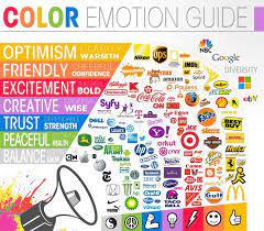
Color Associations and Meanings
Red: Passion, Energy, and Urgency
Red is often associated with passion, energy, and urgency. It can evoke strong emotions and is frequently used to grab attention. Brands employing red in their logos or marketing materials often seek to convey a sense of excitement or intensity.
Blue: Trust, Stability, and Serenity
Blue is commonly associated with trust, stability, and serenity. Many financial institutions and tech companies use blue in their branding to instill a sense of reliability and professionalism. It is also known for creating a calm and trustworthy atmosphere.
Green: Nature, Growth, and Wellness
Green is closely linked to nature, growth, and wellness. Brands in the environmental, health, and organic sectors often use green to convey a sense of freshness, sustainability, and well-being. It represents harmony and balance.
Yellow: Optimism, Clarity, and Warmth
Yellow is associated with optimism, clarity, and warmth. It can evoke a sense of happiness and energy. Brands that want to convey a positive and sunny image often incorporate yellow into their branding.
Purple: Luxury, Royalty, and Creativity
Purple is often linked to luxury, royalty, and creativity. It has a sophisticated and elegant connotation, making it a popular choice for brands that want to communicate a sense of exclusivity and creativity.
Orange: Energy, Enthusiasm, and Playfulness
Orange is associated with energy, enthusiasm, and playfulness. It is a vibrant and attention-grabbing color that can convey a sense of excitement. Brands looking to project a friendly and approachable image often use orange.
Black: Sophistication, Elegance, and Authority
Black is often associated with sophistication, elegance, and authority. It exudes a sense of power and professionalism. Many luxury brands use black in their logos to convey a premium and timeless image.
White: Purity, Simplicity, and Cleanliness
White is linked to purity, simplicity, and cleanliness. It is often used to create a minimalist and modern aesthetic. Brands seeking to convey a sense of purity or simplicity often incorporate white into their design.
Establishing a Cohesive Brand Identity
Consistency in color usage is paramount in establishing a cohesive brand identity. Brands should define a primary color palette and use it consistently across all touchpoints, including logos, marketing materials, websites, and products. This coherence reinforces the brand’s visual identity.
Adaptation to Cultural Differences
While color meanings can be universal to some extent, cultural differences also play a role. Brands with a global presence need to be mindful of cultural interpretations of colors. What may evoke certain emotions in one culture might have different associations in another.
Case Studies: Successful Branding Through Color
Coca-Cola: The Power of Red
Coca-Cola’s iconic use of red is a masterclass in branding. The red color not only grabs attention but also conveys the brand’s energy, excitement, and passion. It has become synonymous with the brand, creating a strong and recognizable identity.
Apple: Sleek Sophistication in Silver
Apple’s use of silver and white exudes sleek sophistication. The minimalist approach communicates a sense of innovation, simplicity, and elegance. The cohesive use of these colors across products reinforces the brand’s premium image.
IKEA: Blue and Yellow for Friendliness
IKEA’s use of blue and yellow reflects its commitment to creating a friendly and approachable shopping experience. Blue conveys trust, while yellow adds a touch of optimism and energy. The combination creates a welcoming atmosphere.
Audience Research and Preferences
Understanding the preferences of the target audience is crucial. Conducting audience research to determine their color preferences, cultural backgrounds, and emotional responses to colors can inform strategic decisions in color selection.
Competitive Landscape
Analyzing the color palettes of competitors helps in differentiation. Choosing colors that stand out within the industry while aligning with the brand’s message is a strategic approach to create a unique visual identity.
Flexibility for Evolution
A brand’s color palette should allow for evolution. As a brand grows or undergoes rebranding, flexibility in color usage ensures adaptability while maintaining brand recognition. Evolution should align with the evolving goals and values of the brand.
Conclusion
The psychology of branding and color is a captivating exploration into the art of crafting a visual identity that resonates with consumers on a deep emotional level. By understanding the meanings and associations of colors, brands can strategically leverage color psychology to convey messages, build recognition, and establish a unique identity in the minds of their audience. In the vibrant world of branding, color is not just a visual element; it’s a powerful language that speaks to the hearts and minds of consumers, forging lasting connections with the brand.